Good Sans
Good Type Foundry · 2018
sans-serifneo-grotesqueitalic
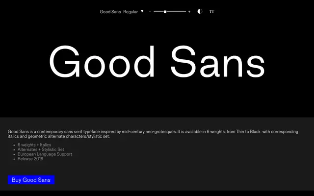
A neo-grotesque sans in six weights with italics and geometric alternates, released in 2018 and inspired by mid-century Swiss-style grotesques.
About
Good Sans draws on the formal language of mid-century neo-grotesques, offering six weights from Thin to Black with corresponding italics. A geometric alternate character set and stylistic set extend its range beyond the core neo-grotesque palette. European language support is included via a broad accented Latin glyph set.
Classification
The foundry describes Good Sans as a contemporary sans serif inspired by mid-century neo-grotesques, placing it squarely in that tradition alongside typefaces like Helvetica and Univers.
Weights
ThinLightRegularMediumBoldBlack
Languages
Latin Extended
Tags
neo-grotesquemid-centurygeometric-alternateseuropeancleanneutral