Motti
Good Type Foundry · Mathis El Idrissi and Kenneth Knutsen · 2025
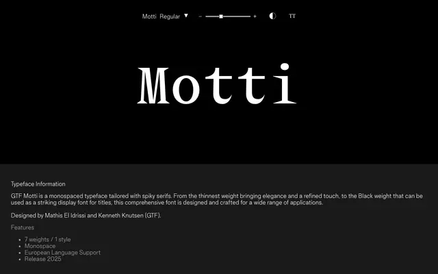
A seven-weight monospaced serif with pointed, spiky serifs that scale from refined text use to bold display work.
About
Designed by Mathis El Idrissi and Kenneth Knutsen for Good Type Foundry, Motti pairs a strict monospaced grid with angular, spiky serifs across seven weights from Thin to Black. The lighter weights carry a sharp elegance suited to running text and editorial settings, while the heavier cuts become expressive enough for titles and display use. European language support is included via an extended Latin glyph set.
Classification
Explicitly described as a monospaced typeface with spiky serifs, making it a monospaced serif. The serifs are described as spiky, giving it a distinctive display character across its weight range.