Opposit
Good Type Foundry · 2016
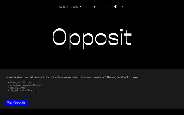
A high-contrast sans with reversed stroke stress, running across eight weights with European language support.
About
Released in 2016, Opposit inverts the conventional relationship between thick and thin strokes, giving it a distinctly unconventional rhythm suited to display and editorial work. Eight weights from Light to Heavy each come with a matching style, and the family includes stylistic sets and alternates for additional flexibility. European language support covers an extended Latin glyph set of over 300 characters.
Classification
Classified as sans-serif with a high contrast subcategory due to its defining feature of reversed or opposite stroke contrast compared to conventional typefaces, placing it in a display-oriented category distinct from standard grotesque or humanist sans families.