Plakat Grotesk
Good Type Foundry · 2016
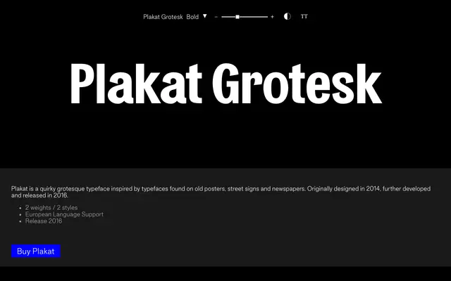
A two-weight display grotesque drawn from old European posters, street signage and newspaper type, with a distinctly quirky character.
About
Originally drawn in 2014 and released commercially in 2016, Plakat Grotesk takes its cues from the rough, idiosyncratic grotesques found on period posters and street signs. It ships in two weights with two styles and covers a broad range of European languages through an extended Latin glyph set of over 300 characters. The quirkiness of its letterforms makes it better suited to headline and display use than running text.
Classification
Described explicitly as a grotesque typeface, with visual inspiration drawn from old posters, street signs and newspapers — placing it firmly in the display grotesque tradition.