Ridder
Good Type Foundry · 2026
serifdisplay serif
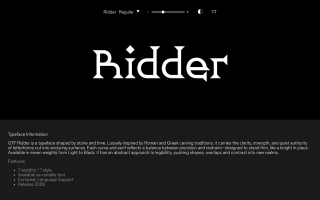
A high-contrast display serif drawn from Roman and Greek stone-carving traditions, available in seven weights as a variable font.
About
GTF Ridder takes its forms from inscriptional lettering, referencing the clarity and restraint of letters cut into stone rather than set in metal. Seven weights run from Light to Black, offered as a variable font with European language support. The foundry describes an abstract approach to legibility, with letterforms that push shape, overlap and contrast beyond conventional bounds.
Classification
Ridder draws from Roman and Greek stone carving traditions, producing high-contrast serifs with an experimental approach to letterform construction and overlap, placing it firmly in display serif territory.
Weights
LightRegularMediumSemiBoldBoldExtraBoldBlack
Languages
Latin Extended
Tags
serifdisplayhigh-contrastlapidarystone-carvedvariableeuropeanexperimental