Riposte
Good Type Foundry · 2016
sans-serifneo-grotesqueitalic
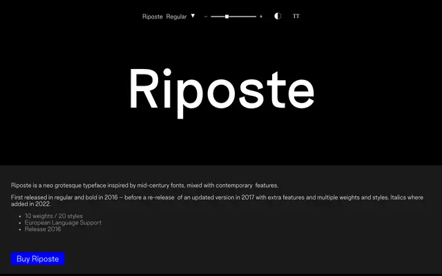
A neo-grotesque sans with mid-century roots, offered in ten weights with matching italics added in 2022.
About
First released in 2016 with just regular and bold cuts, Riposte was expanded in 2017 to cover ten weights across 20 styles, with italics following in 2022. It draws on mid-century grotesque conventions while incorporating contemporary detailing, and ships with broad European language support across an extensive accented character set. A workmanlike family suited to editorial and identity work that wants a clean, neutral grotesque base.
Classification
Described explicitly as a neo grotesque inspired by mid-century fonts with contemporary features, placing it firmly in the neo-grotesque sans-serif tradition.
Weights
ThinExtraLightLightRegularMediumSemiBoldBoldExtraBoldHeavyBlack
Languages
Latin Extended
Tags
neo-grotesquemid-centurycontemporaryeuropeaneditorialversatile