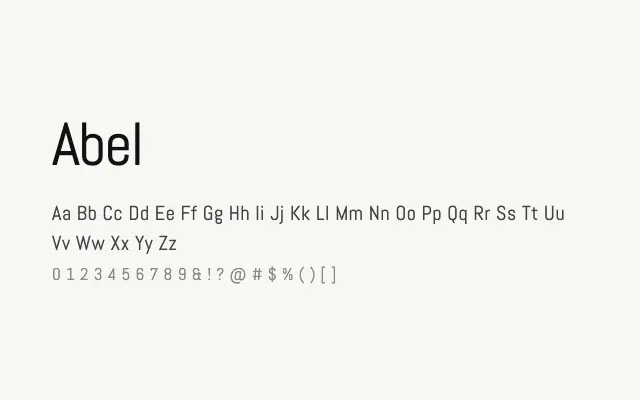
A clean condensed sans with early gothic roots, well-suited to headlines and space-constrained settings.
About
Abel draws on the tradition of condensed gothic lettering to produce a typeface that feels both functional and slightly retro without being overtly decorative. Its single Regular weight keeps it focused, making it a reliable choice for newspaper-style headlines, poster typography, and web headers where horizontal space is limited. It lacks the weight range needed for full typographic systems but excels as a display companion.
Classification
Abel is a narrow, upright sans-serif with a condensed structure influenced by early twentieth-century gothics, giving it a utilitarian yet characterful appearance. Its single weight limits versatility but the tight proportions suit headline use well.