Abril Fatface
Google Fonts · Veronika Burian, José Scaglione · 2011
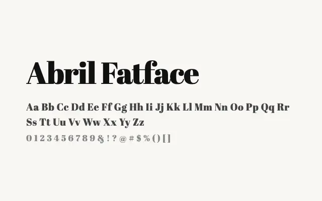
A commanding fat face display serif that channels nineteenth-century poster typography with extreme stroke contrast.
About
Abril Fatface belongs to the fat face tradition of British and Continental display types, where the interplay between ultra-bold strokes and near-invisible hairlines creates immediate visual drama. Designed by TypeTogether, it is best used for large-scale headline work, magazine covers, posters, and branding applications where typographic personality is the point. It pairs naturally with the broader Abril family for editorial contexts requiring both display and text weights.
Classification
Abril Fatface is a bold display serif modelled on nineteenth-century fat face types, featuring extreme stroke contrast with hairline serifs set against very heavy strokes. It is expressly designed for headline impact at large sizes.