sans-serifdisplay sans
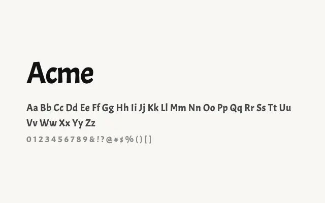
A tight, punchy display sans built for short, impactful headlines.
About
Acme's condensed proportions and clean construction make it well suited to headlines, posters, and digital banners where space is at a premium. Its single weight limits versatility but the design is confident and legible at large sizes. It works particularly well for sports, gaming, or youth-oriented branding.
Classification
Acme is a compact, upright display sans with slightly condensed proportions and a clean, punchy character. Its letterforms are optimised for headlines rather than extended reading.
Weights
Regular
Languages
Latin
Tags
displayheadlineboldcleanpostersans-serifbrandingfreeopen-source