Albert Sans
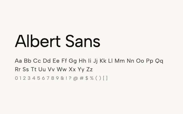
A refined geometric sans blending rational structure with humanist warmth across a full nine-weight range.
About
Albert Sans achieves a balance between the precision of geometric sans design and the legibility benefits of humanist letterforms, giving it broad appeal across branding, editorial, and digital contexts. The complete weight spectrum from Thin to Black enables rich typographic hierarchies within a single typeface family. It is a strong candidate for brand systems requiring consistency from small UI text to large display headlines.
Classification
Albert Sans is a contemporary geometric sans with a full weight range from Thin to Black, combining rational structure with subtly humanist details. It is well-suited to modern branding and user interface design.