serifhumanist serif
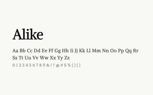
A clean, unpretentious humanist serif with a light touch and useful support for mathematical typesetting.
About
Alike sits in a comfortable middle ground between classical and modern serif design, with open counters and restrained ornamentation that aid readability on screen. Its inclusion of math scripts makes it a sensible choice for academic or scientific digital publications. The single Regular weight does limit its flexibility for complex typographic hierarchies.
Classification
Alike presents clean, open letterforms with low-to-moderate contrast and gently bracketed serifs that blend classical structure with a contemporary lightness. Its math script support gives it a niche academic utility.
Weights
Regular
Languages
LatinLatin Extendedmathsymbols
Tags
serifhumanisttextbodyeditorialcleantechnicalfreeopen-source