Amethysta
serifclassical serif
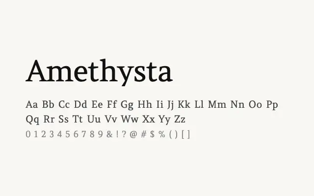
A high-contrast classical serif with Renaissance proportions and a refined, bookish elegance.
About
Amethysta's single weight limits its flexibility but makes its design intent clear: this is a typeface built for elegance at larger sizes. Its sharp serifs and strong stroke contrast recall humanist printing types of the fifteenth and sixteenth centuries. It suits editorial headers, fashion contexts, and anywhere a touch of classical distinction is required.
Classification
Amethysta is a single-weight classical serif with high contrast between thick and thin strokes and refined bracketed serifs reminiscent of Renaissance typefaces. Its elegant proportions lean toward display and editorial use rather than extended body text.
Weights
Regular
Languages
Latin
Tags
serifhigh-contrasteditorialdisplayheadlinefashionelegantrevivalfreeopen-source