sans-serifcondensed sanscondensed
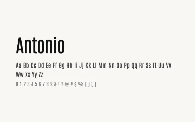
A sharp, condensed sans-serif built for commanding headlines with a distinctly athletic, editorial edge.
About
Antonio's tight proportions and high contrast give it a punchy presence at large sizes, making it a natural fit for sports branding, magazine headlines, and poster work. Its range from Thin to Bold offers considerable flexibility without sacrificing its core character. It performs best when given space to breathe at display sizes rather than set tight in body copy.
Classification
Antonio is a narrow, high-contrast display sans-serif with strong vertical stress and sharp, clean terminals. Its condensed proportions and wide weight range make it well-suited to headlines and sporting or editorial contexts.
Weights
ThinExtraLightLightRegularMediumSemiBoldBold
Languages
LatinLatin Extended
Tags
displayheadlinecondensedhigh-contrastsans-serifbrandingeditorialboldfreeopen-source