Aoboshi One
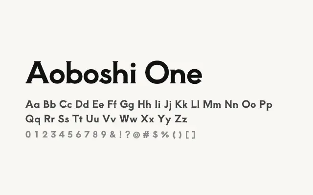
An elegant single-weight Mincho serif crafted for Japanese display typography with a refined Latin companion.
About
Aoboshi One draws on the traditional Mincho style, with the characteristic high contrast and fine bracketed serifs that give Japanese editorial typography its distinctive formality. Its single weight limits flexibility but concentrates its strengths at display sizes, where its delicate stroke modulation reads with clarity and grace. It suits editorial headlines, book covers, and any project calling for a refined Japanese typographic voice.
Classification
Aoboshi One is a single-weight Japanese Mincho-style serif designed for display use, with elegant thin-to-thick stroke contrast characteristic of the genre. Its Latin companion is designed to harmonise with the Japanese glyphs in mixed-script settings.