Architects Daughter
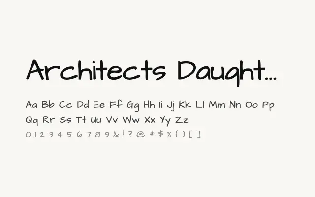
A casual handwritten typeface that captures the informal charm of architectural hand-lettering with an upright, approachable character.
About
Architects Daughter replicates the kind of neat but unhurried handwriting found in sketchbooks and hand-annotated drawings, making it a natural fit for educational materials, informal branding, and web projects with a personal or creative tone. Its upright posture and clear letterforms keep it legible at modest display sizes, though it is unsuitable for body text at small sizes. Its appeal is firmly within casual, expressive contexts rather than formal typographic work.
Classification
Architects Daughter mimics the casual, slightly uneven handwriting style associated with architectural and technical hand-lettering, with clear upright letterforms and a friendly, informal rhythm. Its Latin character set is designed to feel approachable rather than polished.