Asap
Google Fonts · Pablo Cosgaya · 2012
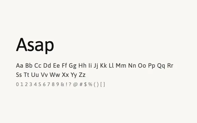
A grotesque sans with a wide weight range and screen-optimised spacing, designed as a practical workhorse for digital use.
About
Asap was built with metric compatibility in mind, allowing it to substitute comfortably for system fonts without reflowing text — a genuine practical advantage in web and app development. Its nine-weight range from Thin to Black gives designers considerable flexibility within a single consistent typeface, covering everything from body copy to bold headlines. Clean and unpretentious, it is one of the more genuinely useful utility fonts in the Google Fonts library.
Classification
Asap is a metrically compatible alternative to classic grotesque sans-serifs, designed to be space-efficient with a broad weight range from Thin to Black. It combines grotesque structure with subtle humanist warmth, making it versatile for both text and display.