Asul
Google Fonts · Mariela Monsalve · 2013
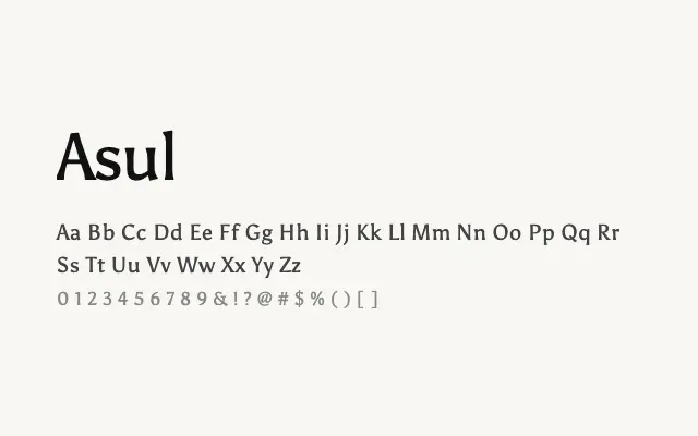
A modest transitional serif with solid, dependable forms suited to body text and simple editorial work.
About
Asul offers a clean, unpretentious take on the transitional serif tradition, with sturdy letterforms that hold up well at small sizes in print and on screen. Its limited palette of regular and bold weights constrains its typographic range, making it best suited to straightforward editorial layouts and simple document design rather than complex hierarchical systems. It is an honest, workmanlike face without strong typographic ambition.
Classification
Asul is a serif typeface with transitional characteristics, featuring moderate contrast and sturdy serifs that give it a grounded, reliable quality. Its minimal two-weight range is a limitation, but the design is clean enough to function credibly at body text sizes.