Atkinson Hyperlegible
Google Fonts · Applied Design Works · 2019
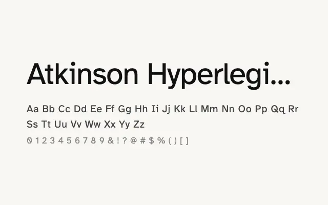
A purpose-built accessibility typeface designed to maximise legibility for readers with low vision.
About
Developed by the Braille Institute, Atkinson Hyperlegible prioritises character differentiation above all else — letters like 'I', 'l', and '1' are drawn to be unambiguous even under difficult reading conditions. It works well for body copy, UI text, and any context where clarity is non-negotiable. Despite its functional brief, it has a warm, approachable character that suits a wide range of applications.
Classification
Atkinson Hyperlegible was developed by the Braille Institute with accessibility at its core, featuring exaggerated character differentiation to reduce misreading at small sizes or for those with low vision. Each letterform is deliberately distinct, avoiding the ambiguity common in conventional sans-serifs.