Balthazar
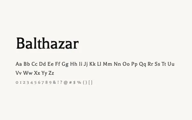
Balthazar is an understated, refined serif with classical proportions that lends quiet elegance to editorial and literary typesetting.
About
Balthazar draws on transitional serif conventions, offering moderate stroke contrast and well-considered letterforms that feel at home in long-form reading contexts. Its single Regular weight limits versatility, but within that constraint it performs admirably for book-style layouts, literary magazines, and editorial design. The clean, unshowy character makes it a reliable choice when the text itself should take centre stage.
Classification
An elegant, light-weight serif with moderate contrast and classical proportions sitting between old-style and transitional classifications. Refined details and open apertures give it a literary character.