seriftransitional serif
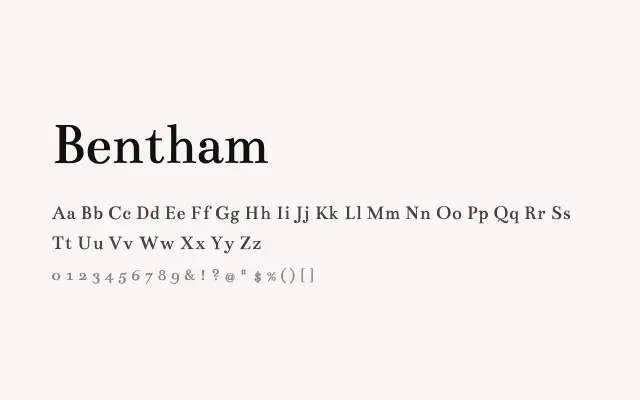
A classically proportioned transitional serif with refined stroke contrast suited to formal editorial contexts.
About
Bentham channels the measured elegance of eighteenth-century typefaces, with clear axis stress and well-defined serifs. It works well for book-style body text, academic publications, and editorial layouts that demand a traditional but legible voice. Its single Regular weight limits versatility, though the design is accomplished within that constraint.
Classification
Bentham is a refined transitional serif with moderate contrast and classical proportions, drawing on eighteenth-century letterpress traditions. Its elegant stroke modulation makes it suitable for formal editorial work.
Weights
Regular
Languages
LatinLatin Extended
Tags
seriftransitionaleditorialbodytexthigh-contrastrevivalcleanfreeopen-source