Bitcount Prop Double Ink
Google Fonts · Petr van Blokland · 2022
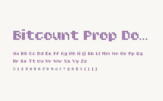
Proportional spacing and a double-cell ink-bleed effect combine to make Bitcount Prop Double Ink the most textured and expressive proportional variant in the family.
About
By layering ink-spread onto the already dense double-cell dot structure and freeing characters to their natural proportions, this variant achieves a richly physical quality unusual in digitally constructed typefaces. Dots bleed and merge in ways that recall screen printing or letterpress on textured stock, while proportional spacing keeps it comfortable for headline runs. It excels in branding, poster design, and editorial work where warmth and character are as important as legibility.
Classification
Merges the proportional spacing of the Prop family with a double-cell dot construction and an ink-bleed effect, combining typographic naturalness with tactile, printed warmth. The interplay between structured dots and organic spread gives it the richest texture in the proportional subfamily.