Bitcount Prop Single
Google Fonts · Petr van Blokland · 2022
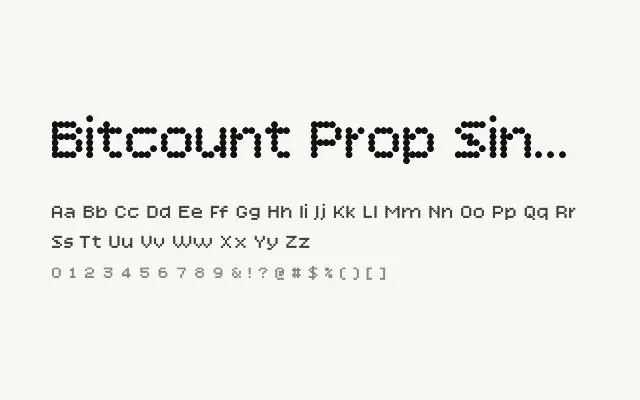
The cleanest and most readable of the proportional Bitcount variants, using a single-cell dot structure with natural character spacing.
About
Bitcount Prop Single applies the minimal single-cell grid logic to a proportionally spaced system, producing pixel letterforms that are open, airy, and highly legible at headline sizes. The absence of ink effects keeps it crisp and precise, making it the most versatile variant for contexts where the pixel aesthetic must remain clear and unambiguous. It is well suited to tech-focused branding, data visualisation headings, and screen-forward editorial design.
Classification
A proportionally spaced, single-cell dot-grid typeface offering clean bitmap letterforms with natural character widths. The single-cell structure keeps forms light and open, while proportional spacing aids readability in display text settings.