Bitcount Prop Single Ink
Google Fonts · Petr van Blokland · 2022
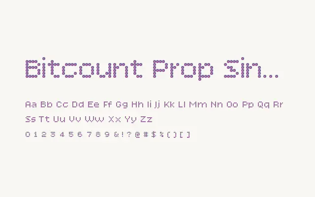
Proportional single-cell dots meet ink-bleed softness in a variant that balances pixel clarity with organic, printed warmth.
About
Bitcount Prop Single Ink takes the open, readable structure of Prop Single and introduces an ink-spread effect that gently merges dot edges, lending the typeface a handcrafted, printed quality without sacrificing legibility. This makes it more approachable and warmer than its purely geometric counterparts, well suited to contexts where the retro-digital aesthetic needs a human touch. It works particularly well in branding, packaging, and editorial headlines where personality is essential.
Classification
Combines proportional spacing and single-cell dot construction with an ink-bleed treatment, softening the pixel grid into something that feels more printed than rendered. It occupies the middle ground between the rigid digital feel of the clean variants and the heavier organic texture of the double-cell ink versions.