Bitter
Google Fonts · Sol Matas · 2011
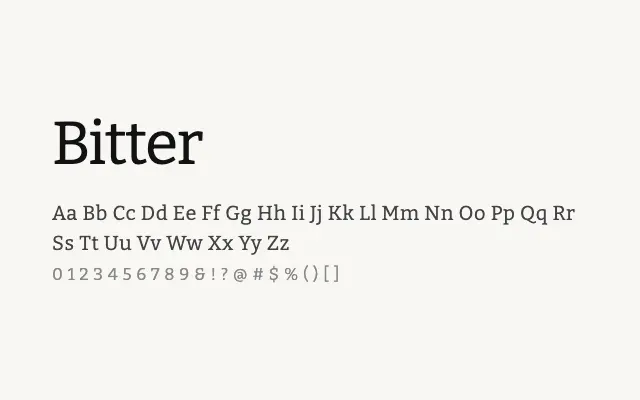
A screen-optimised slab serif with the stamina for long-form reading and the character to hold its own in editorial settings.
About
Bitter was conceived from the outset for digital reading environments, making deliberate choices around stroke weight and serif structure to maintain clarity on low-resolution displays. Its Cyrillic support broadens its utility considerably for multilingual publishing projects. The variable font axis makes it particularly adaptable across responsive web layouts.
Classification
Bitter is a contemporary slab serif designed specifically for sustained reading on screen, featuring sturdy serifs, open apertures, and generous x-height. Its letterforms draw on transitional proportions while optimising for pixel rendering across devices.