seriftransitional serif
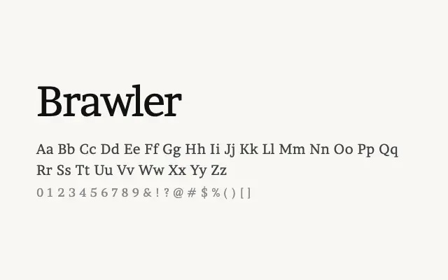
A dependable text serif built for extended reading, with robust proportions that hold up well in print and on screen.
About
Brawler takes cues from traditional newspaper and book typefaces, prioritising legibility and endurance over stylistic flourish. Its sturdy serifs and moderate stroke contrast ensure that it performs reliably across a range of rendering environments. It is a solid choice for long-form editorial content, blogs, and any setting where reading comfort is paramount.
Classification
A sturdy text serif with moderate contrast and robust slab-like serifs, designed explicitly for long-form reading. Its chunky construction gives it a workhorse quality reminiscent of newspaper typography.
Weights
RegularBold
Languages
Latin
Tags
bodytexteditorialserifworkhorsehigh-contrasttransitionalscreenfreeopen-source