Bree Serif
Google Fonts · Veronika Burian, José Scaglione · 2008
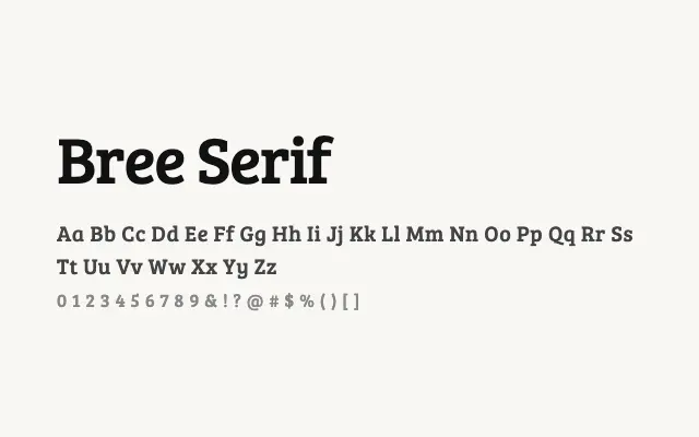
Bree Serif brings an upright italic sensibility to the serif genre, giving headlines a warm, personable energy.
About
Originally designed for RTÉ, Bree Serif's defining trait is its italic-derived letterforms — angled entry strokes and open curves lend it an approachable, slightly informal character unusual for a serif. Available in a single weight, it excels as a display and headline face rather than a text workhorse. It suits branding, advertising, and editorial contexts where personality and legibility need to coexist.
Classification
Bree Serif features a distinctive italic-influenced upright construction, with angled stroke entries and an informal warmth that sets it apart from conventional text serifs. It carries a single weight, making it best suited to display and headline use.