Carrois Gothic
Google Fonts · Ralph du Carrois
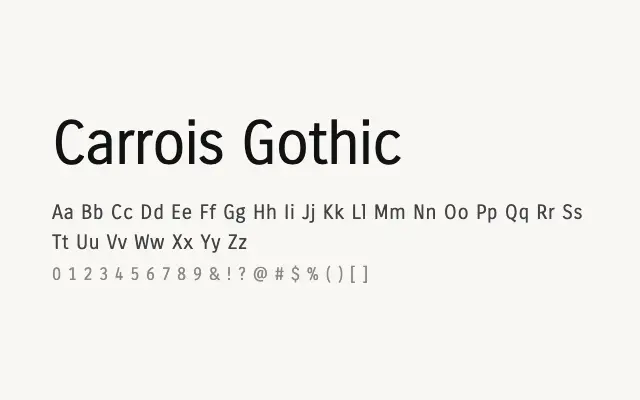
A compact screen-optimised gothic sans designed for efficient, legible digital use.
About
Carrois Gothic was built with on-screen legibility firmly in mind, offering consistent stroke weights and tight but readable spacing that suit interface design and small-scale digital typography. Its gothic character gives it a neutral, workmanlike quality that fits dashboards, navigation, and functional UI contexts without drawing attention to itself. The single Regular weight keeps it simple, though it limits its versatility in more complex typographic hierarchies.
Classification
Carrois Gothic is a compact, screen-optimised sans-serif with gothic influences, designed for clarity at small sizes in digital interfaces. Its slightly condensed proportions and consistent stroke weight make it space-efficient without sacrificing legibility.