Carrois Gothic SC
Google Fonts · Ralph Carrois · 2013
sans-serifgothic small caps sans
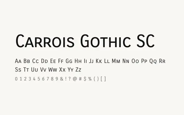
A single-weight grotesque designed entirely in small capitals, giving it a distinctive formal rigidity.
About
Carrois Gothic SC offers a compact, all-small-caps grotesque that suits branding, editorial headers, and UI labels where a restrained, uniform appearance is required. Its even stroke weight and consistent rhythm make it legible at a range of sizes. The lack of a lowercase restricts its versatility, making it best deployed as a titling or accent face.
Classification
A condensed grotesque sans-serif designed exclusively in small capitals, with even stroke weights and compact letterforms. The small caps construction gives it a formal, architectural quality at small sizes.
Weights
Regular
Languages
Latin
Tags
sans-serifgrotesquedisplayheadlinebrandingcleancondensedfreeopen-source