Castoro Titling
Google Fonts · Cesare Davì · 2021
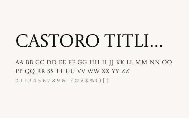
A high-refinement titling serif designed for large-scale typographic applications with crisp classical proportions.
About
Castoro Titling takes the design language of Castoro and optimises it for headlines, posters, and editorial display use, where tighter spacing and greater optical precision come into their own. The elevated contrast between thick and thin strokes gives it a distinguished, fashion-forward presence suited to luxury branding and cultural publishing. It performs best when used generously in size and not set for continuous reading.
Classification
A display-weight titling cut of the Castoro serif family, with refined contrast and letterforms optimised for use at large sizes. Sparing spacing and high optical precision distinguish it from the text-weight sibling.