Convergence
sans-serifhumanist sans
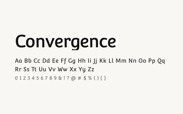
A quiet, readable humanist sans that serves body text and UI applications without drawing attention to itself.
About
Convergence's open forms and modest weight make it a serviceable choice for digital interfaces and running text where legibility is the priority. It lacks the refinement and range of more established humanist sans families, limiting its appeal for premium work. Nonetheless it functions reliably for everyday web use.
Classification
A lightweight humanist sans with open apertures and gentle stroke variation. The design feels understated and approachable, prioritising readability over strong stylistic identity.
Weights
Regular
Languages
LatinLatin Extended
Tags
sans-serifhumanistbodytextscreenuicleanneutralfreeopen-source