Didact Gothic
sans-serifhumanist sans
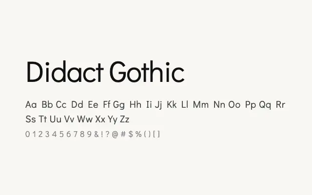
A sober humanist sans conceived with legibility and clarity as its guiding principles.
About
Didact Gothic takes its cues from letterforms used in early reading education, resulting in unambiguous, open characters that read cleanly at text sizes on screen and in print. It covers Cyrillic, Cyrillic Extended, and Greek, making it genuinely useful for multilingual publishing. The single weight is a limitation for complex typographic work, but it remains a reliable workhorse for straightforward text setting.
Classification
A clean, low-contrast humanist sans-serif with open apertures and a didactic, neutral character. Designed with legibility as its primary concern, drawing on the tradition of teaching alphabets.
Weights
Regular
Languages
CyrillicCyrillic ExtendedGreekGreek ExtendedLatinLatin Extended
Tags
sans-serifhumanistbodytextscreenneutralcleanmultilingualfreeopen-source