Do Hyeon
sans-serifKorean sans
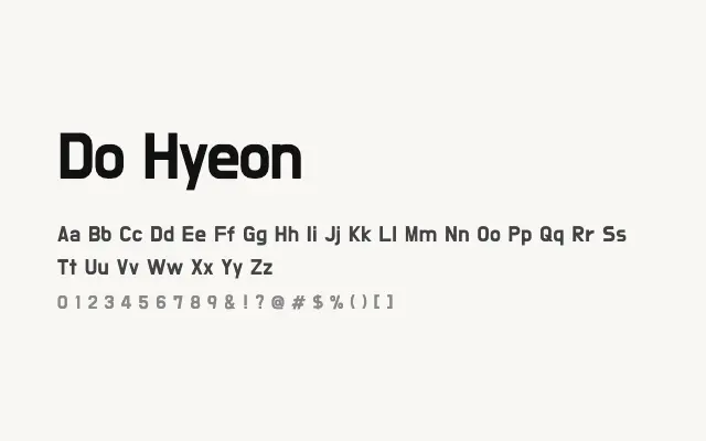
A modern, clean Korean sans-serif with a friendly geometric character well-suited to digital interfaces.
About
Do Hyeon is designed with screen readability in mind, offering clear, open Hangul letterforms that perform well at interface sizes as well as in headlines. Its slightly rounded, geometric quality gives it a contemporary feel that works for app design, web UI, and editorial contexts in Korean-language settings. The Latin companion is functional and harmonious, making bilingual Korean–Latin typesetting straightforward.
Classification
A clean, geometric-leaning sans-serif designed primarily for Korean Hangul, with a contemporary and approachable character. The Latin companion shares the same open, rounded quality.
Weights
Regular
Languages
KoreanLatin
Tags
sans-serifgeometricscreenuiheadlinemultilingualcleanroundedfreeopen-source