seriftransitional serif
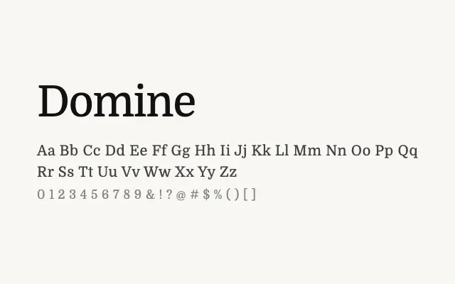
A reliable transitional serif designed with screen legibility in mind, covering a useful range of weights.
About
Domine's balanced contrast and well-spaced letterforms make it a dependable choice for long-form web reading, blog content, and editorial layouts. Its four weights from Regular to Bold give designers enough flexibility for hierarchy without excess. It sits comfortably alongside both humanist sans and more formal serif companions.
Classification
Domine draws on classical transitional serif conventions with moderate contrast and sturdy bracketed serifs suited to screen reading. Its proportions are generous and its forms are clean without being cold.
Weights
RegularMediumSemiBoldBold
Languages
LatinLatin Extended
Tags
seriftransitionalbodytexteditorialworkhorsescreenfreeopen-source