Economica
Google Fonts · Joel Carrouché · 2011
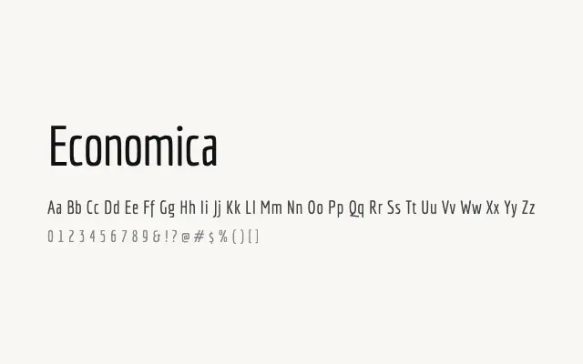
A tightly condensed grotesque designed for maximum economy of space without sacrificing readability.
About
Economica's narrow proportions and tall x-height allow it to fit significantly more text per line than conventional sans-serifs, making it well suited to data-dense interfaces, captions, and editorial layouts where column width is at a premium. Its restrained, utilitarian character keeps it versatile across branding, print, and screen contexts. The limited weight range of Regular and Bold keeps the palette simple but functional.
Classification
Economica is a narrow, lightweight sans-serif with a utilitarian character reminiscent of typewritten or stencilled letterforms, optimised to pack a great deal of text into a small horizontal footprint. Its tall x-height and compressed proportions make it space-efficient at both display and text sizes.