Englebert
sans-serifhumanist sans
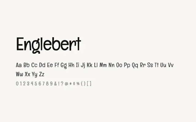
A modest, readable humanist sans that favours warmth and clarity over typographic ambition.
About
Englebert has open letterforms and gentle curves that give it a likeable, unpretentious character well suited to web interfaces and editorial use at body sizes. The single Regular weight makes it a limited choice for projects requiring hierarchy, though it pairs comfortably with more robust display faces. It is a dependable workhorse for straightforward digital publishing at small-to-medium sizes.
Classification
Englebert is a friendly, low-contrast humanist sans-serif with slightly informal proportions and open apertures. Its single weight limits versatility but the letterforms are clean and approachable.
Weights
Regular
Languages
LatinLatin Extended
Tags
sans-serifhumanistfriendlycleanuibodyscreenfreeopen-source