Epunda Slab
serifslab serifitalic
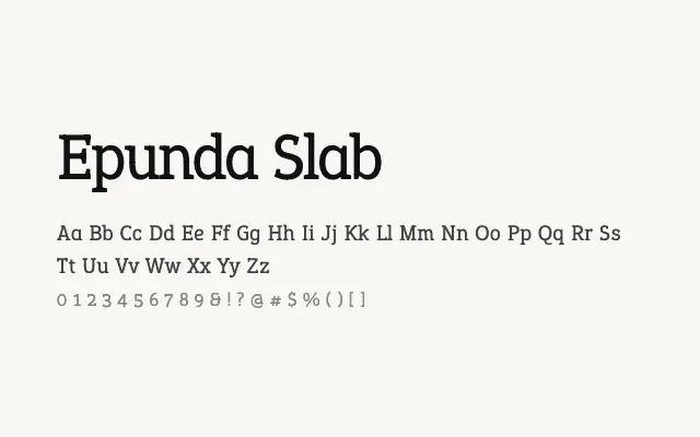
A sturdy companion slab serif that mirrors the Epunda Sans family for seamless mixed-type design.
About
Epunda Slab's close relationship to Epunda Sans makes the two faces a natural pairing for editorial and branding work that benefits from serif and sans contrasts within a single coherent system. Its seven weights from Light to Black cover text, subheading, and display roles with equal confidence. The design prioritises workhorse legibility, making it reliable for long-form print and screen content.
Classification
Epunda Slab matches the proportions and weight range of Epunda Sans with squared slab serifs, creating a coherent superfamily with clear structural consistency. Contrast is low-to-moderate, favouring legibility.
Weights
LightRegularMediumSemiBoldBoldExtraBoldBlack
Languages
LatinLatin Extended
Tags
serifslabbodytexteditorialbrandingworkhorsecleanfreeopen-source