Erica One
displaydisplay sans
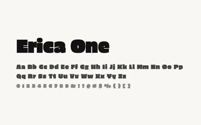
A punchy, high-contrast display sans built for bold headline and poster applications.
About
Erica One commands attention through its combination of strong weight, tight optical spacing, and expressive contrast, giving it a confident graphic presence at large sizes. Its single Regular weight is misleadingly named — it reads as a bold display cut and is best applied to headlines, posters, and packaging. Extended body text is not a realistic use case, but for short, impactful display copy it delivers well.
Classification
Erica One is a bold, high-contrast display sans with a strong graphic character, tight spacing, and expressive weight that dominates at large sizes. It is single-weight and clearly intended for headline use only.
Weights
Regular
Languages
LatinLatin Extended
Tags
displayheadlineboldexpressiveposterbrandingsans-serifhigh-contrastfreeopen-source