Fahkwang
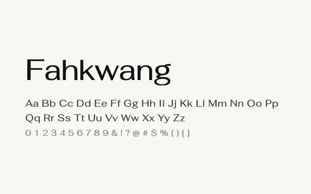
A refined geometric sans-serif designed to harmonise Thai and Latin scripts within a single cohesive modernist framework.
About
Fahkwang's primary strength lies in its careful balancing of Thai and Latin letterforms, making it a thoughtful choice for bilingual communications across Southeast Asian markets. The geometric construction and generous weight range from ExtraLight to Bold give designers considerable expressive latitude. It performs well in editorial, branding, and headline settings where a clean international aesthetic is valued.
Classification
Fahkwang is a dual-script typeface balancing Thai and Latin glyphs with a clean, modernist geometric approach, featuring low contrast and precise, open letterforms. The Latin component is elegant and restrained, sitting comfortably alongside its Thai counterpart.