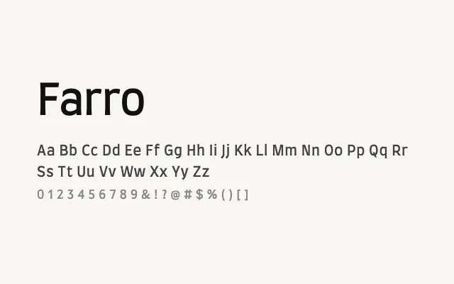
A clean, approachable humanist sans that prioritises legibility and practicality across screen and print contexts.
About
Farro brings a straightforward, well-mannered approach to humanist sans-serif design, with consistent letterforms that work reliably for interface design, body text, and subdued branding. Its Light through Bold weight range covers standard typographic hierarchies without fuss. While it lacks the distinctive personality of more characterful typefaces, its reliability and neutrality make it a dependable choice for functional design work.
Classification
Farro is a humanist sans-serif with optically balanced letterforms and a clean, friendly disposition, offering practical legibility across a modest weight range. It maintains good proportions and avoids the quirks that undermine more experimental designs.