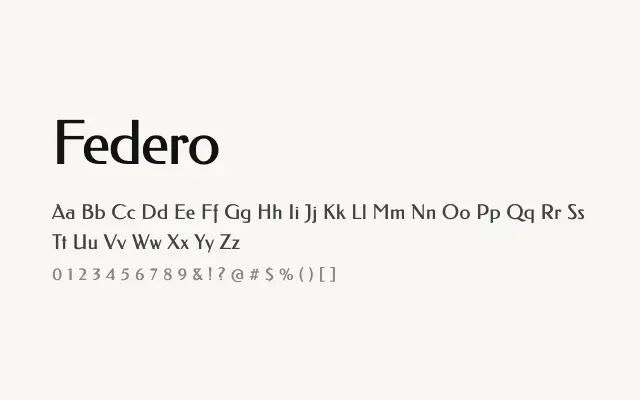
A calm, humanist sans-serif with gentle calligraphic traces that make it readable and quietly distinctive without drawing attention to itself.
About
Federo's restrained design makes it a dependable choice for editorial text, UI copy, and branding contexts where legibility and a touch of warmth are needed without expressive flourish. Its single weight is a real practical constraint, limiting its usefulness in complex typographic systems that demand hierarchy through weight variation. Nonetheless, as a text face in light-weight contexts or combined with a contrasting display typeface, it performs solidly.
Classification
Federo is a clean, understated humanist sans-serif with subtle calligraphic underpinnings that give its letterforms quiet personality without tipping into expressiveness. It sits comfortably in the space between geometric neutrality and organic warmth.