seriftransitional serif
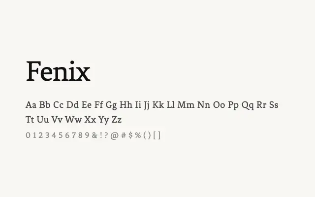
A solid single-weight transitional serif with balanced proportions and reliable legibility.
About
Fenix occupies a dependable middle ground in the serif spectrum, drawing on classical proportions without leaning into either old-style warmth or modern severity. It suits editorial body text, long-form reading, and print-oriented design work. The lack of additional weights constrains its typographic flexibility in complex hierarchies.
Classification
Fenix features moderate contrast between thick and thin strokes with sturdy serifs, sitting between old-style and modern classifications. Its robust construction makes it legible at smaller sizes despite being a single-weight design.
Weights
Regular
Languages
LatinLatin Extended
Tags
seriftransitionaleditorialbodytexthigh-contrastfreeopen-source