Fira Sans Condensed
Google Fonts · Carrois Type Design · 2014
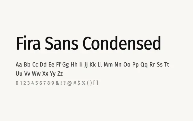
The condensed cut of Fira Sans retains all its humanist warmth while delivering a narrower footprint suitable for headlines and dense layouts.
About
Fira Sans Condensed is a direct companion to the standard Fira Sans, sharing its open letterforms and broad script support in a tighter width. It is well suited to headline and subheading use where column widths are restricted, as well as navigation labels and UI components under space pressure. The complete weight range from Thin to Black gives it genuine flexibility for typographic hierarchy in condensed settings.
Classification
Fira Sans Condensed maintains the humanist character and open apertures of the standard Fira Sans while reducing horizontal width for space-constrained settings. The full nine-weight range is preserved, giving designers considerable typographic range in compressed layouts.