Fraunces
Google Fonts · Phaedra Charles, Flavia Zimbardi · 2020
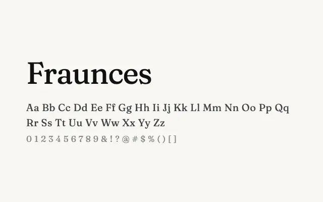
A characterful variable serif with deliberate optical quirks that make it one of the most distinctive display typefaces on Google Fonts.
About
Fraunces was designed with a so-called 'wonk' axis, allowing letters to shift between orthodox and idiosyncratic forms, giving designers precise control over personality. Its high contrast and soft, slightly swollen curves reference late Victorian display types while feeling entirely contemporary. It suits editorial mastheads, branding projects, and any context demanding a serif with genuine visual character.
Classification
Fraunces is an optically variable 'wonky' serif with deliberate quirks in letterform construction, drawing on late nineteenth-century display type traditions. Its optical size axis and softly irregular curves give it a distinctive, expressive warmth.