displaydisplay sans
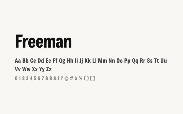
A punchy, heavyweight display sans built for maximum impact at large sizes.
About
Freeman's bold geometric construction and uniform stroke weight make it well suited to headlines, posters, and branding work where visual authority is required. Its single Regular weight limits versatility, but within its intended role as a display face it performs with confidence. Best deployed at large sizes where its strong letterforms can assert themselves fully.
Classification
Freeman is a bold, single-weight display sans with strong geometric construction and confident letterforms. Its thick strokes and tight spacing give it a pronounced, assertive presence suited to large-scale use.
Weights
Regular
Languages
LatinLatin ExtendedVietnamese
Tags
displayheadlinegeometricboldbrandingpostersans-seriffreeopen-source