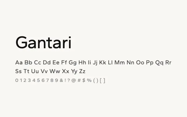
A well-constructed geometric sans with a broad weight range, built for both interface design and editorial use.
About
Gantari's nine weights from Thin to Black make it a genuinely flexible workhorse capable of handling everything from small UI copy to large display headlines within a single type family. Its geometric foundations are softened by subtle humanist details that maintain legibility across sizes and weights. It is a solid choice for product interfaces, digital publishing, and brand identity systems that require typographic consistency.
Classification
Gantari is a versatile geometric sans-serif with a full nine-weight range, featuring clean, rational letterforms with subtle humanist touches that aid legibility on screen. It is designed with modern UI and editorial applications clearly in mind.