Gowun Dodum
sans-serifKorean gothic sans
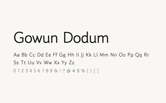
A plain, dependable Korean gothic sans-serif designed for readable on-screen text in a single functional weight.
About
Gowun Dodum delivers the essential qualities of a Dodum-style Korean sans — even stroke weight, clear Hangul construction, and good screen legibility — without ornamentation. Its single Regular weight makes it best suited to body copy, captions, and interface labels where consistency rather than contrast is the priority. Paired with Gowun Batang, it forms a coherent Korean type system.
Classification
A straightforward Korean Dodum-style sans-serif providing uniform stroke weight and open letterforms for comfortable on-screen reading. Single-weight only, restricting its scope to body and UI text rather than hierarchical typography.
Weights
Regular
Languages
KoreanLatinLatin ExtendedVietnamese
Tags
sans-serifneutralmultilingualbodytextuiscreencleanfreeopen-source