Grenze
Google Fonts · Omnibus-Type · 2019
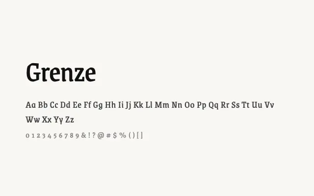
A high-contrast serif with gothic undertones, suited to dramatic editorial and display work.
About
Grenze occupies an unusual space between classical serif typography and blackletter tradition, with pronounced stroke contrast and sharply cut serifs that give it a brooding authority. It works well for editorial headlines, book covers, and branding projects that demand historical gravitas with a contemporary edge. Its wide weight range, from Thin to Black, gives designers flexibility across both refined and intense applications.
Classification
Grenze is a high-contrast serif with a dark, gothic editorial character, drawing on blackletter influences while remaining rooted in Roman serif structure. Its dramatic stroke contrast and sharp serifs make it better suited to display sizes than continuous text.