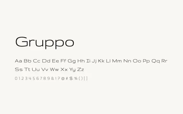
An unusually proportioned geometric sans with a tiny x-height and art deco modernist character.
About
Gruppo's defining feature is its dramatically reduced x-height relative to its capitals, creating a distinctive rhythm that feels directly influenced by early twentieth-century modernist and art deco titling. It works as a headline or logotype face for projects where a period-inflected, architectural quality is desired. Its single weight and idiosyncratic proportions mean it functions best as an accent typeface rather than a workhorse.
Classification
Gruppo is an ultra-low x-height geometric sans with wide, condensed-feeling proportions and a strongly stylised character rooted in 1920s–30s modernist lettering. Its extreme design choices make it highly distinctive but limited in functional range.