sans-serifhumanist sansitalic
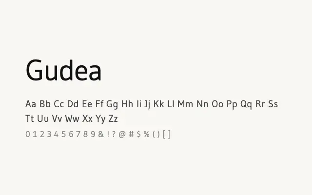
A clean, screen-optimised humanist sans designed for comfortable reading in digital interfaces.
About
Gudea prioritises legibility above personality, with open counters, humanist letter construction, and even stroke contrast that performs reliably at small sizes on screen. It suits UI text, web body copy, and app interfaces where readability and neutrality take precedence over typographic distinction. The limited two-weight family constrains its typographic range, but both weights are well drawn and functionally sound.
Classification
Gudea is a clean, neutral humanist sans-serif with open apertures and even stroke weights designed specifically for screen legibility. Its modest character set and two-weight range keep it practical but limited.
Weights
RegularBold
Languages
LatinLatin Extended
Tags
sans-serifhumanistbodytextuiscreencleanneutralfreeopen-source