seriftransitional serif
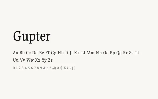
A classical transitional serif with restrained elegance suited to extended reading.
About
Gupter draws on the traditions of 18th-century European book typography, with moderate stroke contrast and sturdy bracketed serifs that hold up well at text sizes. Its three-weight range — Regular, Medium, and Bold — offers enough flexibility for editorial hierarchies. It works well in long-form print or screen reading environments where legibility and quiet authority are required.
Classification
Gupter is a refined serif with classical proportions, moderate contrast, and bracketed serifs reminiscent of 18th-century book typefaces. Its three weights make it practical for long-form editorial use.
Weights
RegularMediumBold
Languages
Latin
Tags
seriftransitionaleditorialbodytexthigh-contrastworkhorsefreeopen-source